Creative Direction & Event Strategy
2026
SAIT School for Advanced Digital Technology
reignitesait.ca
Background
Re: IGNITE Creative Technologies Awards is SADT's annual flagship event celebrating outstanding student work across three program streams - Interactive Design (IDD), Film & Video Production (FVP), and Radio Television & Broadcast News (RTBN).
Held every year at SAIT in Calgary, the event brings together graduating students, faculty, industry professionals, and donors for an academy-style awards ceremony and networking gala. It serves as the formal transition moment between student life and professional industry - the night where student work meets real-world recognition.
Core problem
Three compounding issues undermined the event's potential:
First, submission rates were low enough that the same student repeatedly won multiple awards across categories - defeating the purpose of a celebration of diverse talent.
Second, the brand communicated Ignite as an obligation rather than an opportunity. Students saw submission as a high-effort chore with no clear personal benefit.
Third, without a master brand, every year required a full rebrand from scratch - wasting budget on event assets that couldn't be reused and failing to build any institutional recognition over time.

Solution: The Prism Concept
The core strategic decision was to separate the brand into two tiers: a permanent master brand and an annual campaign layer. Re: IGNITE Creative Technologies Awards would function as the institutional identity that persists indefinitely, while each year's campaign theme refreshes the visual language on top of it.
This mirrors how major awards ceremonies like The Game Awards operate - the core identity never changes, the campaign evolves annually.
The 2026 campaign theme - The Prism - visualizes the brand truth: raw student potential enters SADT as white light and refracts into specialized professional output. Each program stream is represented by a distinct SAIT institutional color: Cyan for IDD, Red for FVP, Purple for RTBN.

Brand System
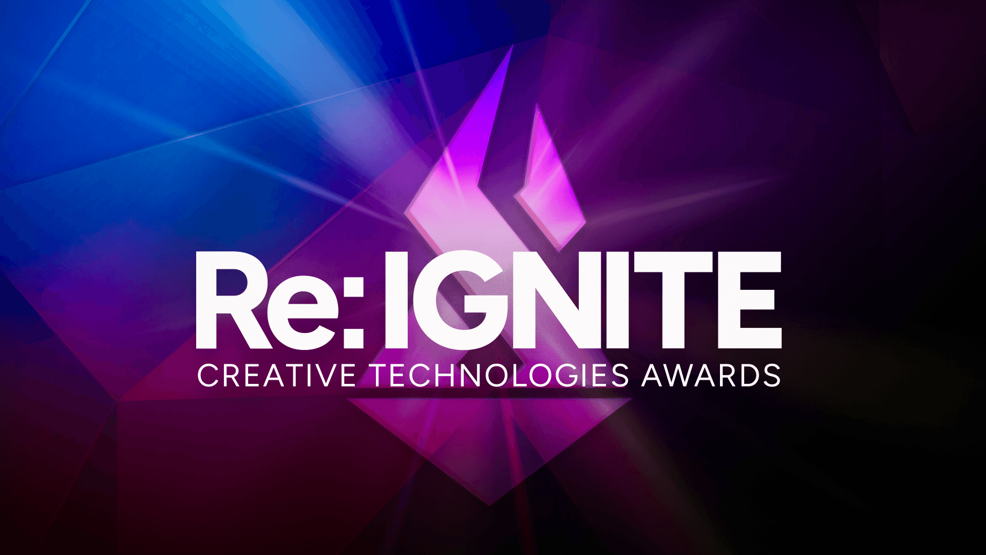
The logomark is a geometric torch form - a diamond base representing the rare element, an S-curve flame referencing SADT, and an internal negative space representing the spark that exists before ignition. The mark carries the complete brand narrative: Re: IGNITE doesn't create student talent, it reveals it.
The wordmark pairs "Re: IGNITE" in Figtree typeface with "Creative Technologies Awards" as an institutional subtitle. The "Re:" prefix - borrowed from email subject line formatting - signals activation, return, and relaunch. It positions the event as a response to student potential, not a demand on student time.
The Prism Concept
White light appears colorless - but it contains every color simultaneously. When passed through a prism, that hidden spectrum is revealed. The light doesn't change. The prism simply makes visible what was already there.
This is the central metaphor of Re: IGNITE 2026.
Students enter SADT as white light - full of undifferentiated potential, energy, and creativity. SADT is the prism. Through two to three years of rigorous training, iteration, and real-world problem solving, that raw potential refracts into specialized, distinct professional identities. A filmmaker, A broadcaster, A designer. Each one a different wavelength of the same original light.
The Prism is not just a visual direction. It is the brand's answer to the question every student asks before submitting their work: "Is what I made good enough?" The answer the brand gives back is yes - because the prism only refracts light that was already there.

Key Takeaway
The brand architecture solves the longevity problem permanently. By separating master brand from campaign, Re: IGNITE can expand beyond three programs, beyond SADT, and beyond any single year without requiring a rebrand. Every asset produced in 2026 establishes the system that 2027 builds on top of.
Positioning students as the hero - not the event - directly addresses the submission problem. The brand promises recognition and industry validation, not participation for its own sake.


Results and Impact
Brand concept and logomark approved by the academic chair and SAIT deans. The Prism campaign received full stakeholder approval across all decision-making levels.
Delivered a complete brand system including master brand guidelines,campaign posters, ticket and submission variants, bifold pamphlet, email flyer, and award announcement card - all built on a single reusable visual system.
Event scheduled for April 29, 2026 at Irene Lewis Atrium, Stan Grad Centre, SAIT.